📋 Heuristic Evaluation
Expert review based on Nielsen's 10 Usability Heuristics to catch obvious violations.
👥 Usability Testing
Observed 3 participants performing core tasks to identify navigation issues.
🛠️ Iteration
Applied changes to the High-Fidelity prototype based on severity ratings.
Key Findings & Fixes
Missing Birth Date Field
Issue: While creating an account, the screen does not ask for the birth date. This might lead to the progress cannot provide suggested ideas based on the user’s age.
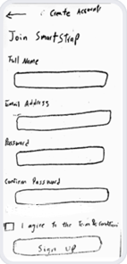
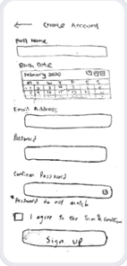
Action Taken: A birth date field with a proper date picker will be added to ensure that the user profile is more complete.
Missing Help Section
Issue: User lacks help if pairing fails.
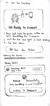
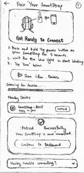
Action Taken: Added “Having trouble connecting” so that when the user encounters issues, they can reach out for some solutions or help while clicking on the button.
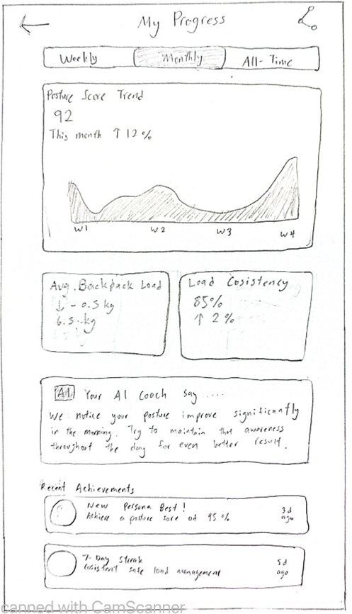
Unbalanced Spacing (History)
Issue: The large gap making the layout feel broken into two separate pieces and was less obvious that both cards showed related progress information.

Action Taken: Readjust the wireframe so the two cards sit on the same horizontal line with consistent margins.
Missing Show Password Toggle
Issue: On a phone screen, it’s easy to press wrong key especially with the longer passwords. Users may get stuck in a few rounds of “wrong password”.
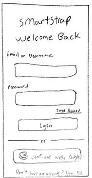
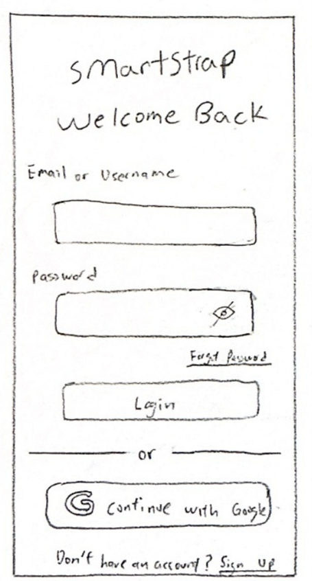
Action Taken: Added a show/hide eye icon to the password field, so all passwords can optionally view by user.
Inconsistent Navigation
Issue: Because the global navigation bar disappear on this screen user can feel stuck and unsure how this page relates to the rest of app.

Action Taken: Updated design to keep the same bottom navigation bar. Removed extra back arrow to make navigation consistent.
System Status & Navigation Labels
Issue: Battery life was hidden, "wavy line" for posture was confusing, and nav bar lacked text labels.
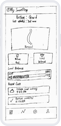
Action Taken: Added battery icon, replaced wavy line with "Posture Status" card, and added explicit text labels to bottom navigation.
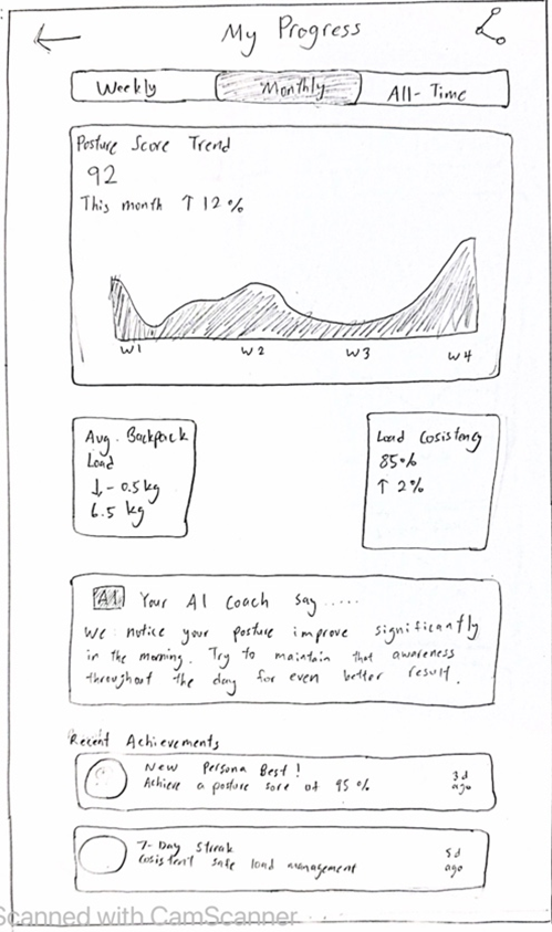
Data Visualization & Recall
Issue: Blank graphs gave impression of malfunction. Text-only stats failed to support recognition rather than recall.

Action Taken: Added populated area chart for hourly trends. Added intuitive icons (sad face, strap, clock) to data cards.
Task 1: Live Posture & Load Status
The participants were engaged in communication with the screen that showed live posture and weight distribution. In general, they liked the transparency of warnings like “RIGHT HEAVY”! and the powerful directional arrow that hurriedly conveyed disequilibrium. Although, users also found it difficult to determine whether they were seeing live or historical posture data, which is an indication of a failure in the visibility and labelling processes. Poor placement in a sub menu made some users unable to find the live posture feature, and a few complained of duplicated elements of Good Posture status. These results show that Task 1 needed better visibility, clearer hierarchy, and reduced redundancy.
| Category | Positive Findings | Issues Found | Severity | What It Means |
|---|---|---|---|---|
| Visibility | Big text alert ("RIGHT HEAVY!!!") was immediately visible | Users could not tell whether data was current or historical | 3 – Major | Missing labels caused confusion about data currency |
| Clarity | The imbalance in the loads was identified by an arrow marker | Backpack weight label was ambiguous | 2 – Minor | Users misunderstood weight as recommended. |
| Navigation | Directional cues were a strong feature | Live posture screen hidden in sub menu | 3 - Major | Users expected this feature in the main page. |
| Efficiency | Simple text was easy to process | Repetition of posture status wasted space | 1 – Cosmetic | Too many duplicated visuals reduced efficiency |
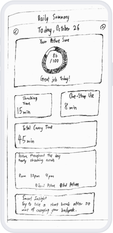
Task 2: Daily Posture Summary & AI Chatbot
Users generally found the daily posture summary screen clean, readable, and supported by strong visual hierarchy. Variables like Slouching Time and One-Strap Usage were very appreciated. The AI chatbot was also commended as being simple to engage with. Nevertheless, a number of usability issues were identified such as inconsistent navigation, poor comprehension of what the Posture Score was, no voice input option to activate the chatbot, and preset quick action prompts. Task 2 needed enhancements in terms of navigation consistency, better metric explanation, and affordances of AI input.
| Category | Positive Findings | Issues Found | Severity | What It Means |
|---|---|---|---|---|
| Layout | Clear, clean and scannable summary | Navigation bar was not found by users | 3 - Major | Navigation inconsistency breaks task flow |
| Metrics | Helpful metrics (Slouching Time, One-Strap Use) | Posture Score lacked tooltip/explanation | 2 – Minor | Users lacked context for the score |
| Chatbot | Basic and intuitive interface | No voice input, there should be a microphone icon | 1 - Cosmetic | Unclear affordances for multimodal input |
| Efficiency | Users wanted preset quick prompts | No shortcuts were available | 2 – Minor | Added user effort for common queries |
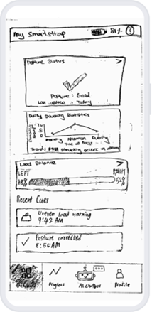
Task 3: Dashboard Status & System Information
Users found the dashboard visually clean, with intuitive icons and helpful time-stamped events in the Recent Cues log. The load balance bar (48 / 52%) was applauded as being numerical and visual. However, users also noted certain problems such as significant measures such as slouching statistics were not made prominent, the spine illustration was not dynamic, and battery level was placed in Settings although it is important. Users mistakenly tapped non-interactive rectangular summaries, indicating ambiguous actionable elements. These issues highlight gaps in visibility, affordance, and prioritization.
| Category | Positive Findings | Issues Found | Severity | What It Means |
|---|---|---|---|---|
| Visual Design | Visual design icon/emojis were easy to understand | Fixed spine image was not responsive to bad posture | 2 - Minor | The users wanted dynamic visual response. |
| Information Value | Recent cues log enhanced context | Slouching statistics not visible | 3 - Major | Users need actionable trends, not only live status |
| System Status | Load bar was clear | Battery status hidden in Settings | 3 – Major | Violates visibility of system status |
| Affordances | Dashboard was clean and organized | Users tapped non-interactive boxes | 2 - Minor | Interactive vs non-interactive items unclear |
💡 What We Learned & How It Shaped the Design
Our iterative evaluations combining heuristic evaluation, usability testing, and design critique revealed consistent patterns across all three tasks. A major learning was that visibility and clarity play a significant role in facilitating effective interaction with the users. Large and high-contrast alerts and defined metrics received a highly positive response among participants. But most found themselves in difficulties when labels were ambiguous, screens were indented in an unforeseen place or when indicators were not clearly defined to be live. This further enhanced the need to have conspicuous labelling and natural information arrangement in our design.
Another key insight was the user's expectation for dynamic and interactive elements. As an example, the fixed Posture Score was seen to be tappable with the generation gaps in expectations. In the same manner, the sequential spine image also deceived users, to assume it would vary depending on slouching. This feedback inspired us to design it with real-time interactivity, being able to hover/tap and be able to see what the system is doing and increase its discoverability and transparency.
Navigation consistency also emerged as a serious issue. The respondents were constantly reporting missing navigation bars, hidden screens, or discrepancies in paths between tabs. This revelation influenced the redesign of a common set of navigation, where all the core screens share the common bottom navigation bar and permanent shortcuts. This minimized thinking and avoided task breakdowns.
User expectations for AI interaction were higher than anticipated. Although the chatbot UI was praised for simplicity, participants wanted voice input, preset prompts, and quick actions for common queries. This indicates that users expect AI companions to provide efficiency, not just conversation. We incorporated quick-access buttons such as "Show my weekly trend", "Explain my score", and "Why did I slouch?" to align expectations with functionality.
Finally, the evaluations highlighted the need for prioritizing actionable and safety-critical information. Battery status and slouching statistics were significantly important for metrics of long-term engagement and reliability of the system, but they were buried or displayed too subtly. As a counter, we restructured the dashboard by prioritizing these metrics to the forefront, using more vivid icons, moving images, and more salient contextual indicators. The general impression of the iterative insights is to have a design that is more understandable, interactive, more consistent, and closer to the expectations of the users.